
An ikebana studio providing a mindful and meditative floral experience.
Branding + brand collaterals
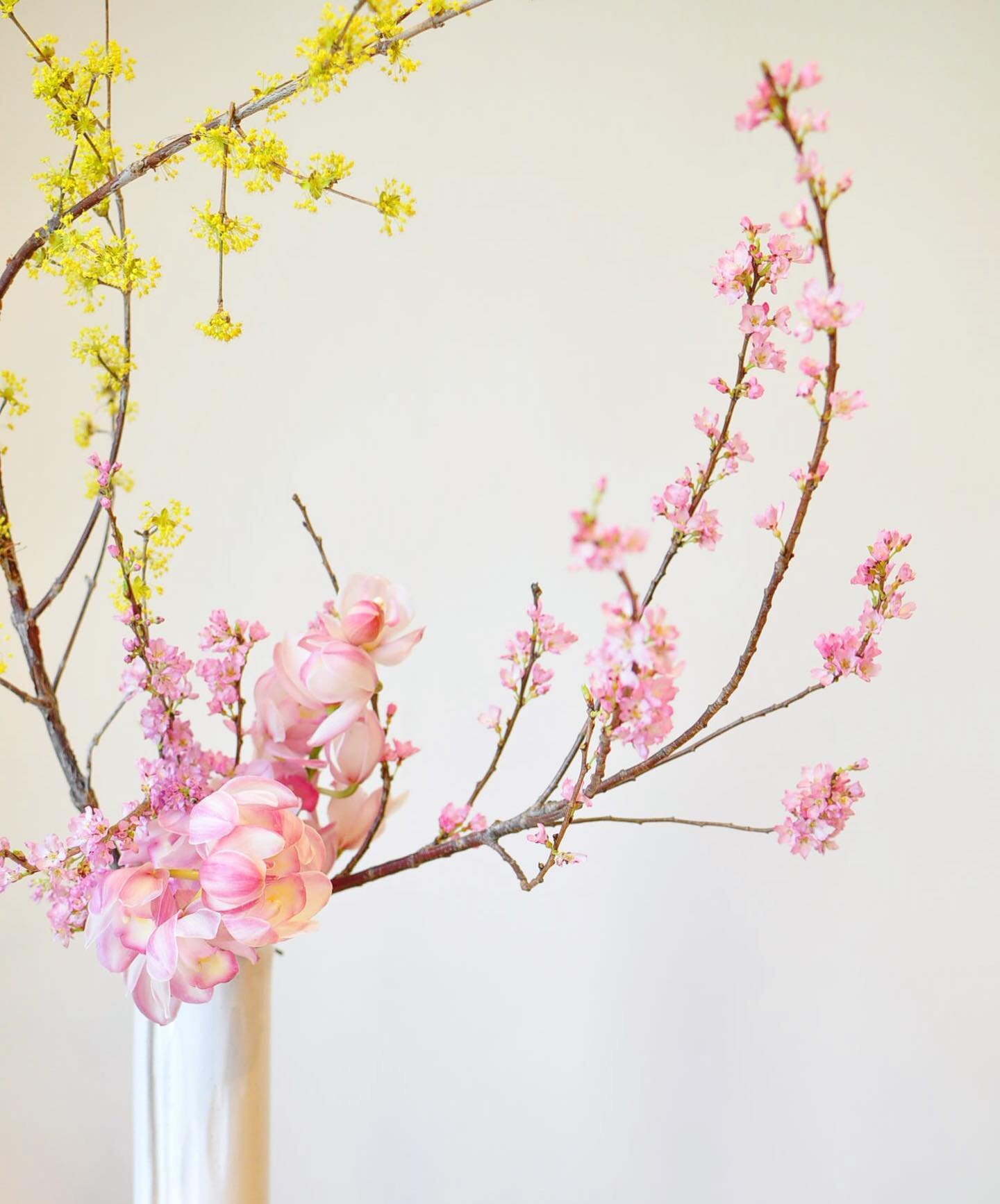
BRAND STORYAtelier Shuka is an ikebana studio run by Hiromi Fujikawa in Tokyo, Japan. Being an ikebana artist for almost two decades, Hiromi believes that ikebana is not just a way of arranging flowers, but also an appreciation of beauty that is often overlooked in life.
Ikebana highlights the importance of harmony, an essential component of Japanese culture, and the practice of mindfulness.
INSPIRATIONSWe needed the brand to reflect elegance and a rooted connection to Japanese culture, while also infusing Hiromi’s personality.
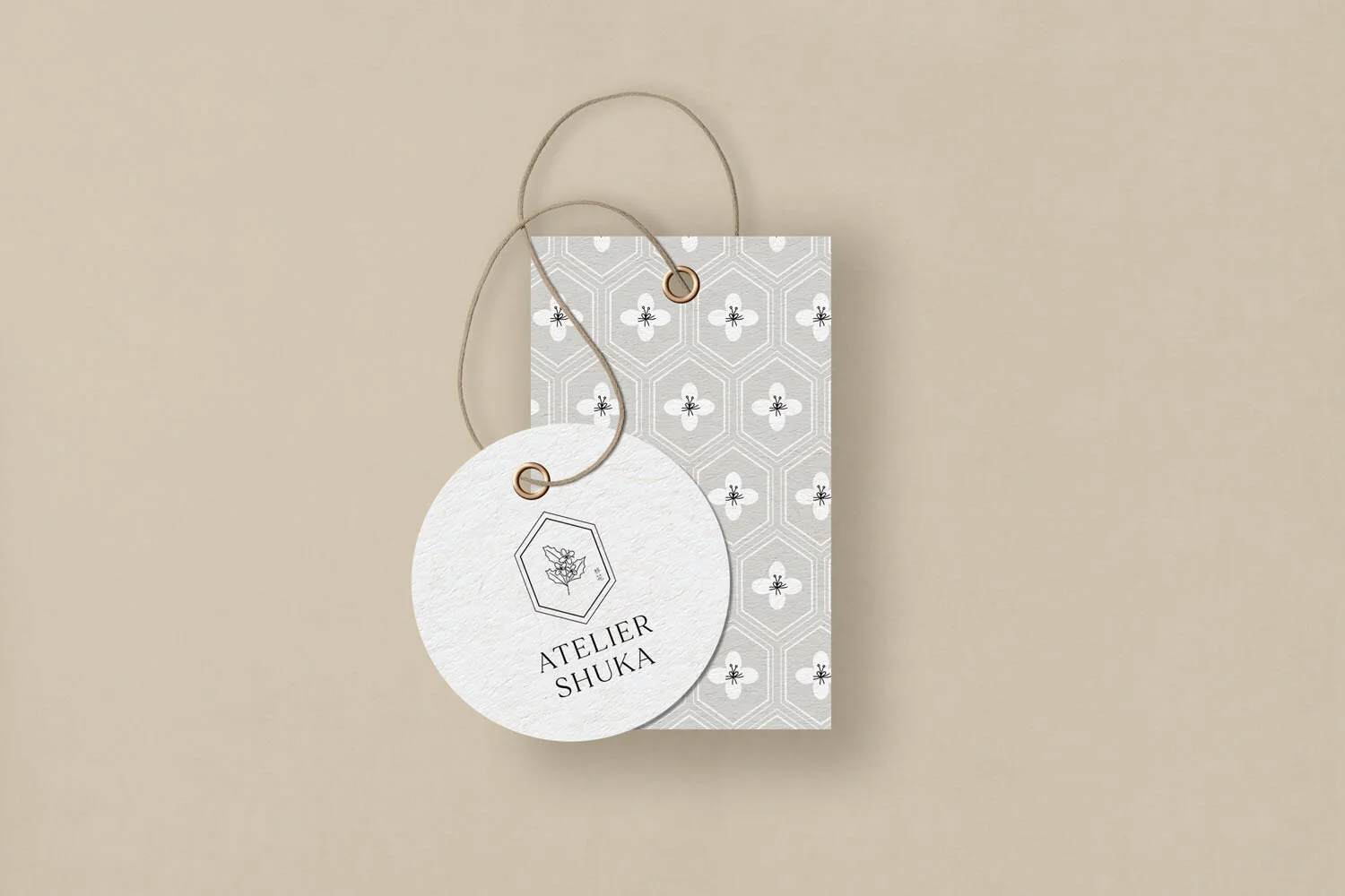
With that in mind, I created a custom hand-drawn illustration of a holy plant that represents her ikebana name and nested it inside an elongated hexagon that symbolizes good luck in Japanese culture.


Logo VariationsAs the studio grows, Hiromi may need logo variations which are flexible for different brand applications. So I created a few logo variants and brand marks to support her business.
Marks are great assets to have and can be used as little details and special touch for your brand. The brand mark for Atelier Shuka is designed to look like a stamp to leave a sweet little mark on Hiromi’s beautiful ikebana photos or for other brand applications.
COLOR PALETTE Brand colors are kept minimal and sophisticated to bring out Hiromi’s signature elegant styling.
Brand PatternFor the brand pattern, I wanted to tie Hiromi’s sophisticated brand back to its Japanese roots. I took inspiration from Japanese old patterns for summer kimono (yukata) to create this modern minimalist pattern that is feminine, elegant yet rooted strongly in Japanese tradition.
I also wanted to give a sense of tranquility, so I used mainly whites lines with a little black accent for the details of the holy plant flowers and put it against the warm grey color as background.


BRAND IMPLEMENTATIONAll brand collaterals and social media templates are kept minimal to keep a refined and feminine feel throughout the brand.
With this cohesive brand identity, Hiromi is able to bring out her story, elegant styling and provide a mindful brand experience for her ikebana clients.


CREDITS: IKEBANA ARRANGEMENT image / ATELIER SHUKA BY HIROMI