
Clean and whole quality nut-based treats with a mission to make healthy snacking simple and easy part of daily life
BRANDING + PACKAGING
BRAND STORYSage is a clean and whole quality food brand founded by Cortney Smith, a Registered Dietitian Nutritionist in Redding, California. Sage was born from Cortney’s personal journey of overcoming sugar addiction and a passion to make simple, healthy, and quality treats convenient for the ones she loves.
Her mission for Sage is to inspire and let people discover how simple it is to live a holistic lifestyle and leave a legacy of impact.
Backed with her science degree in Dietetics, Cortney constantly shares her nutritional wisdom with her audience through her gluten-free, dairy-free, refined sugar-free, vegan and organic Sage Treats, easy & simple Sage Recipes, and tips to living a healthy + whole life in Sage Articles.
BRAND inspirationWe wanted Sage to be a whole brand experience, not just consuming healthy treats. Holistic lifestyle is the central theme for the brand and we wanted the Sage brand to feel intentional, bold yet feminine, and inspiring.
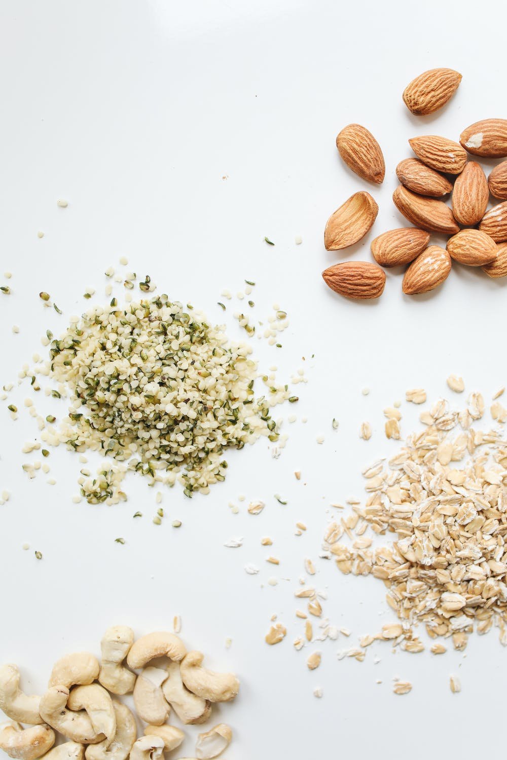
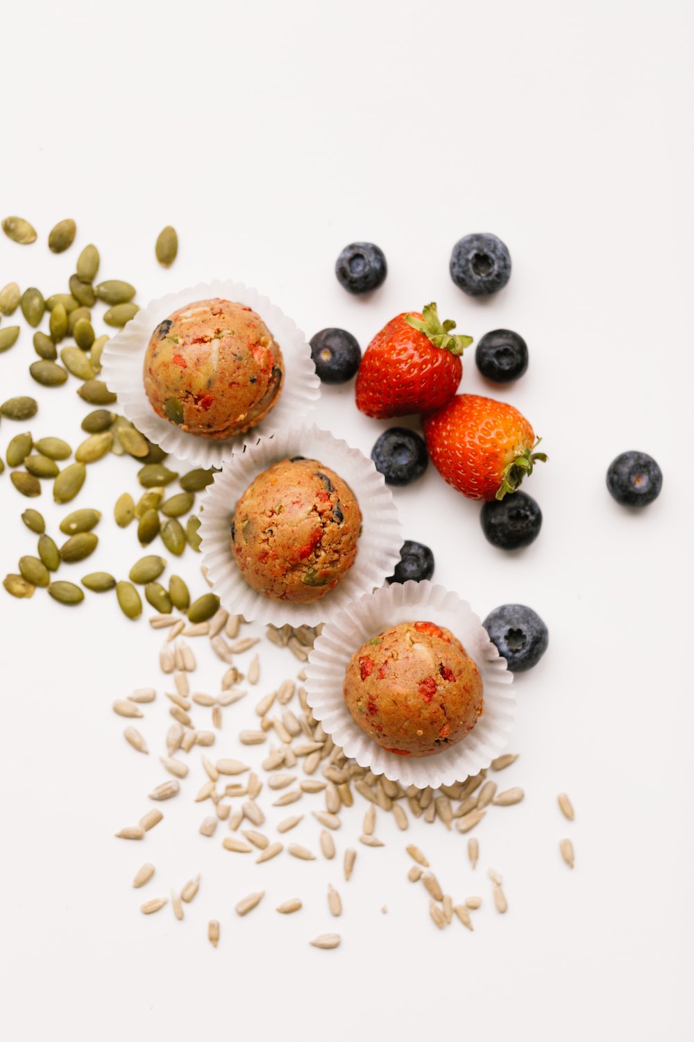
The brand focuses on clean and whole quality nut-based treats, so we draw a lot of inspiration from the ingredients and Sage Treats’ star product (the power balls) to inform our design.

THE LOGOA bold serif with clean-cut terminals and smooth curves is chosen to convey the bold move of the brand’s aim to cut through the convolution and deception of the “clean food” industry, as well as the heart to nurture and inspire holistic living. It captures the brand’s essence of being bold yet feminine. The bold serif type also gives an overall feeling of wisdom and reliability and highlights the founder’s expertise as a Registered Dietitian Nutritionist.
Plus, we really want to break away from the common clean food industry aesthetics - chunky or handwritten-style logotype and bright, colorful palette.
BRANDMARKWe created two graphic elements to represent the brand story and acts as an extension of the logo. The first brandmark is specific for Sage Treats with an aim to deliver its tagline in a fun & memorable way. The shape is inspired by the power balls with a bite mark that mimics a peanut to help emphasize the nut-based ingredients.
The second brandmark represents the overall Sage brand and is an iconic symbol for Sage. For this mark, I combined the two power balls to form a capsule and have the main nut-based ingredients (almond and cashew) nested inside each other. The almond shape also resembles an eye and reinforces Cortney’s vision to share nutritional wisdom through Sage. It is a simple graphic yet powerfully conveys what Sage is all about.

SAGE TREATS BRANDMARK
SAGE BRANDMARK


PRODUCT IMAGE CREDITS: SAGE